Diced
Precision Meets Swagger in the Barbershop Experience
Overview
DICED began as the vision of a young barber determined to flip the script on the traditional barbershop. I partnered with him early in his journey to build more than a logo, we built a brand that represents precision, presence, and personal style.
The Outcome
a clean, bold identity that lives beyond the chair. From the dual-dice logo symbolizing sharp craftsmanship to the minimalist aesthetic of the full visual system, every design decision was intentional. DICED now operates as a successful barbershop with a strong, recognizable brand that resonates deeply with its audience.
Brand Discovery & Strategy
I began with a deep-dive session into the founder’s story, values, and goals. We mapped out DICED’s tone, personality, and target audience-ambitious clients who value precision, culture, and consistency. From this, we clarified the brand’s unique position: a barbershop that blends swagger with structure.
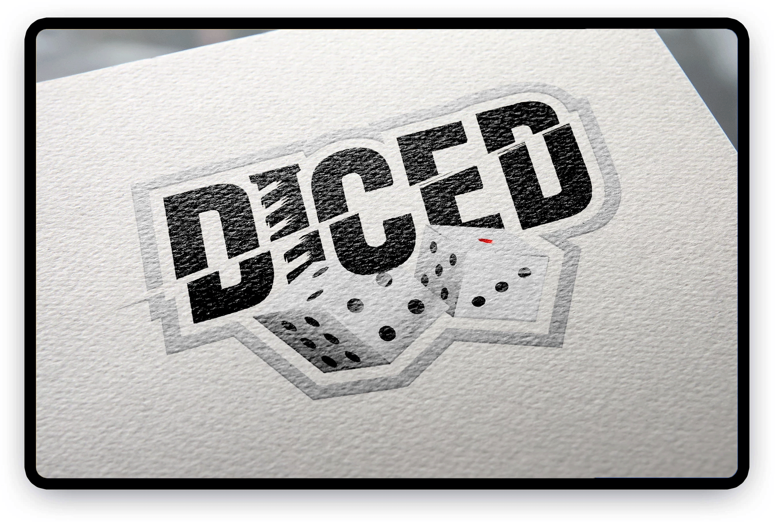
02. Logo Design
The logo was built around the concept of chance meeting control-two dice to represent precision and calculated risk, merged with a subtle barber pole to keep the roots clear. The typography was chosen to be bold and readable, giving it a confident presence whether it’s on glassware, apparel, or the app.
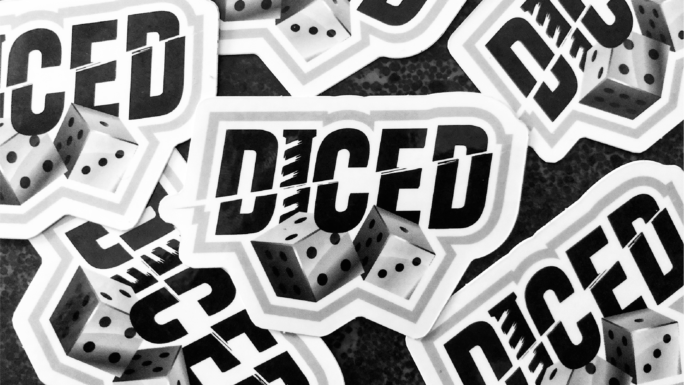
03. Visual Identity System
To support the logo, I created a scalable identity system. This included:
- A versatile color palette with monochrome dominance
- A typographic system for digital and print
- Applications for stickers, apparel, social media, and digital interfaces
The system was designed to be easily implemented across platforms, empowering the client to maintain brand consistency as the business grows.
Now, DICED isn’t just a name, it’s a movement. 💈🎲