M3 Handyman Services
Home Improvement Built on Legacy
Overview
🔧M3 Handyman Services, LLC is a home improvement company built on the name, legacy, and values of its founder where the three “M’s” reflect a personal story and a professional commitment to excellence. The client came to me seeking a bold, modern identity that would represent the full scope of their handyman services while standing out in a crowded industry.
This brand needed to communicate reliability, pride in craftsmanship, and trustworthiness so I crafted a logo system and visual identity rooted in structure, clarity, and clean design.
Brand Values
M3 is built on four guiding principles:
- Deep Roots: Grounded in local heritage and long-standing service.
- Pride in Work: A commitment to quality materials and skilled technique.
- Respect for Life: Prioritizing safety, sustainability, and well-being.
- Trust: Reliability through communication, transparency, and consistency.
These values became the north star for the visual language I developed.
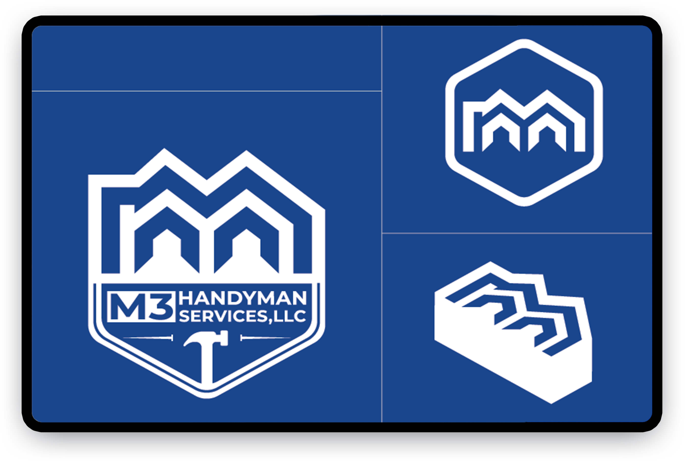
Logo Design & Symbolism
The final logo combines modern typography (Montserrat Bold) with a custom mark that represents:
- Three M’s to symbolize the founder’s initials
- A home silhouette to anchor the brand in residential services
- Integrated tool elements (wrench, hammer) to speak directly to the handyman trade
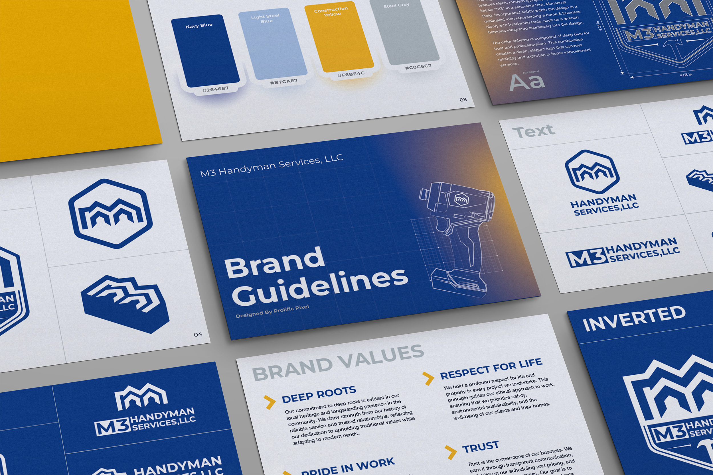
Set within a shield shape, the logo evokes strength, protection, and professionalism. The deep blue color palettereinforces trust and creates a polished look across print, digital, and uniforms.
Identity System & Versatility
To ensure adaptability and long-term use, I created:
- Inverted logo variations for light/dark backgrounds
- Icon-only options for social media, decals, and app icons
- A 3D badge mockup to explore dimensional branding applications
- Typography and color usage guidelines for consistency
Final Take
M3 Handyman Services now has a confident, scalable brand identity that captures both the personal story behind the name and the professional reliability their clients depend on.