Refresh
Overview
Refresh is more than a brand it’s a movement grounded in mental wellness, cultural expression, and authentic healing. Created by licensed therapist and author Gary Taylor, Refresh invites people to find peace through the hobbies that bring them joy from basketball and sneakers to music, coffee, and cars.
Gary’s vision was to shift the narrative around therapy, removing clinical walls and replacing them with something relatable, accessible, and healing.
I partnered with Gary to help visually and digitally bring this mission to life, building out the Refresh brand through a custom website, book cover, and visual identity that resonates with real people in real moments.
The Challenge
How do you brand therapy in a way that speaks to the culture, not just the clinic?
Gary needed a platform that was as authentic, personal, and powerful as the stories he shares. He wanted to connect mental health with everyday life especially for those who may not traditionally seek therapy but need healing all the same.
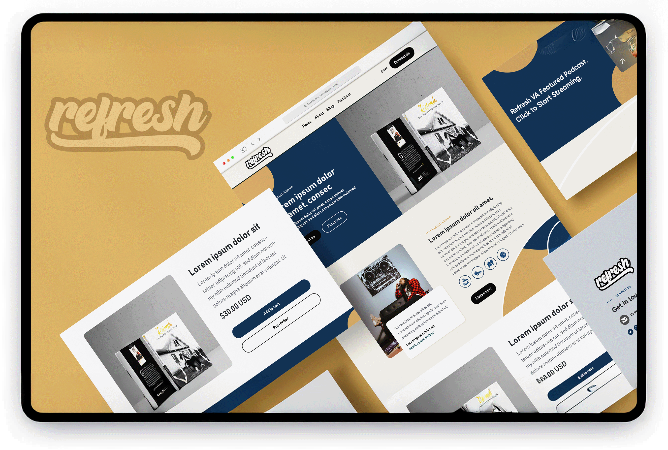

Website Design
The website was built to feel like home part community hub, part digital diary, and part storefront.
Key Features:
- Hero storytelling that introduces Gary and the movement
- Seamless book pre-order and purchasing flow
- Podcast promotion and streaming callouts
- Mobile-first layout for accessibility and clarity
- Color palette inspired by peace, purpose, and soul
The design fuses therapeutic calm with cultural edge like stepping into a barbershop that doubles as a sanctuary.
Book Cover Design
For Refresh: The Journey to Find Peace, I designed a cover that felt like a page from Gary’s personal diary raw, torn, and true.
Visual Approach:
- High-contrast imagery of Gary in a reflective moment
- Torn-paper texture and handwritten overlays to represent vulnerability
- A balance of clean typography with a distressed, journal-like visual language
- Back cover elements that highlight Gary’s personality and mission
The cover captures the essence of the book: healing, honesty, and the courage to process pain.
Brand Tone & Aesthetic
- Logo: Bold, script-style logotype with a nostalgic sneaker/hip-hop vibe
- Voice: Authentic. Reflective. Empowering. Never preachy.
- Palette: Navy, gold, black, cream grounded and soulful
- Imagery: Urban textures, cultural hobbies, expressive portraiture
Outcome
Refresh now exists as a full-bodied brand with a mission to make mental wellness personal. It invites people to find peace through what they love from hooping to journaling to just sitting with their thoughts.
Through thoughtful design, storytelling, and brand development, Refresh is helping redefine how we talk about therapy from something clinical to something cultural.
Services Provided:
- Brand Strategy + Visual Direction
- Full Website Design + Development
- Ecommerce Integration
- Book Cover Design + Print Production Prep
- Art Direction + Storytelling Guidance